hotspotr: hotspot mapping in R
08 Jul 2014
Updated 6/17/2016: A new version of hotspotr is available for download here. The new version is a standalone program with a number of improvements and better performance than the R package discussed here, which still works but is no longer maintained.
A very alpha version of a package I put together to do hotspot mapping in R is now available on github. All you to get started is a a dataset with x,y coordinates and markers for case vs. control status (i.e. home locations of diseased vs. non-diseased individuals).
Although there are already great packages out there to do this kind of thing (i.e. sparr and spatstat), I put this together to make it easy to compare between different algorithms and also to facilitate plotting the hotspot map on top of a geographic map using the ggmap package.
The following is a short demo of how the package can be used to create a very simple hotspot map using the algorithm of your choosing to calculate local case densities (i.e., distance-based mapping, kernel density estimation, etc.). In the next few weeks, I hope to post a tutorial or two talking about these methods and potential applications in more depth.
Demo
To install, make sure you have the devtools package installed and loaded and run:
require(devtools)
install_github("jzelner/hotspotr")
Import hotspotr:
require(hotspotr)Generate a set of (x,y) points in the unit square:
x <- runif(1000)
y <- runif(1000)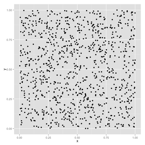
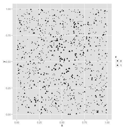
Using the random_hotspot function in hotspotr, place an area of increased risk in the center of the square. In this case, we’ll select an area covering the middle 30% of the unit square where 80% of individuals within this are are cases and only 20% outside of it are cases, for a relative risk of 4:
hs <- random_hotspot(x, y, 0.3, 0.8, 0.2)Create a new data frame with case points labeled as z = 1 and controls as z = 0:
hs <- data.frame(x = x, y = y, z = as.factor(hs[["z"]]))We can plot this and see anecdotally that there is a greater density of cases (represented by triangles) in the center:
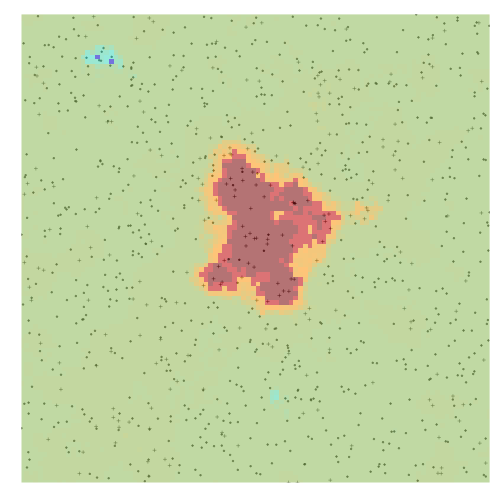
We can verify whether this area of increased density is statistically significant using the hotspot_map function in hotspotr.
The first argument to hotspot_map is the data frame with columns x, y, and z with x and y coordinates and case/control designations, respectively. The second argument is the density estimation method to use (currently only the distance-based-mapping method of Jeffery et al. is supported (as the function dbm_score_rr).
User-defined density functions can easily be written. All that is required is a function of the form fn(hs) that returns a density measure at each (x,y) point in the hs dataframe. p specifies the width of the smoothing window, and color_samples specifies the number of random permutations of case/control designations to use when generating the color scale for the map:
hm <- hotspot_map(hs, dbm_score_rr, p = 0.03, color_samples = 100, pbar = FALSE)We can then plot the resulting map and see that in fact the area at the center of the map represents a likely hotspot:
plot(hm)