Voronoi intensity mapping with R and d3: Part 1
26 Feb 2015A few years ago, the Philadelphia Inquirer published a map of the geographic location of all murders in Philly from 1988-2012, which you can find here.
The Inquirer map is helpful for showing the exact location of homicides in Philadelphia, and the tools they provide for filtering based on time periods, weapons used, etc., make it a useful tool for understanding the grisly geography of homicide in the city.
But where it doesn't quite work as a visualization is in highlighting the spatial density of murder in the city; relying on circular markers to highlight the location of each homicide means that there is a lot of overplotting in areas that have experienced more than their fair share of violent crime.
I've been thinking about Voronoi diagrams for a while now in the context of disease mapping, and thought that a Voronoi intensity map might be the right way to do justice to these data. I'll get into the details below, but without further ado, here's the final product:
Voronoi Diagrams
The basic idea behind a Voronoi diagram is that it is a set of polygons representing the set of points closest to a first set of pre-specified points. So, on the map, each Voronoi cell represents the set of points closer to one of the homicides in the data set than any other. The intuition behind Voronoi intensity mapping is that the closer points are together in a given area, the smaller the Voronoi cells in that area will be. So, we can measure the density of points in the area - in this case homicides - by taking the inverse of the area of a given cell. On the map, the intensity of color represents the density, i.e. 1/area. My approach to generating this map was to use R to pre-process the homicide data into a Voronoi diagram that I then wrote out as geojson, converted to topojson, and then loaded up into the browser to plot with d3. I did this for a couple of reasons. The first was that I'm already comfortable doing polygon clipping in R with the excellent polyclip package. The other is that I didn't want to force the browser to re-generate the voronoi cells every time the file was loaded.Data
The first thing I had to was get the data. To do this, I went to the very excellent OpenDataPhilly site, which directed me to the City of Philadelphia's GIS server, where you can download all Part 1 crime incidents and locations from 2006-2015 as a CSV or using their JSON API. I downloaded the whole dataset in CSV format and filtered out everything but the homicides.Voronoi diagrams in R
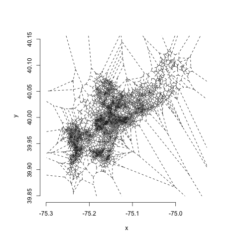
First, using the deldir package, we create a set of Voronoi polygons, with one polygon for each of the homicides in the dataset:require(deldir)
voronoi <- deldir(point_file$POINT_X, point_file$POINT_Y)Using the basic deldir plotting function, this yields something that looks like this:
 One thing you might notice is that there are some very small polygons in the highest density areas and very jagged, irregular ones in low-density areas. One of the weaknesses of Voronoi estimators is their high variability, which makes them very sensitive to noise. One way to deal with this is to do a little bit of regularization using centroidal Voronoi estimation. All this involves is running a few steps of Lloyd's algorithm, in which we take the output of a single interation of the voronoi tesselation and make the centroids of the voronoi cells the input sites to the next iteration. When we repeat this twice, this is what we get:
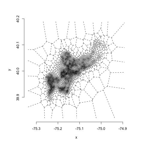 You can see this gives us a little less of the extreme variability in polygon size, while still maintaining the large differences in density across space.
Polygon Clipping
So, we can see the vague outline of the city of Philadelphia and a variety of polygon sizes. But we're not quite there on the intensity map.
The first thing we need to do is to clip the polygons to the borders of the city. This will ensure that the areas of the polygons in our intensity map match the portions of the city that they're meant to cover, rather than the arbitrarily large polygons at the edges of the diagram.
To do this, we import the geojson of Philadelphia neighborhoods, also available from OpenDataPhilly, and collapse down the neighborhood boundaries into a single polygon. Usually, this is pretty straightforward using the unionSpatialPolygons command in the maptools package, but there's some cruft in this particular set of polygons that makes it hard to condense them down into a single one with a single command. So, to take care of this, we'll use a little S4-fu:
phila_map<- readOGR("data/Neighborhoods_Philadelphia.geojson", "OGRGeoJSON")
phl_outline <- unionSpatialPolygons(map, IDs=rep(1,length(phila_map)))
outline_coords <- phl_outline@polygons[[1]]@Polygons[[1]]@coords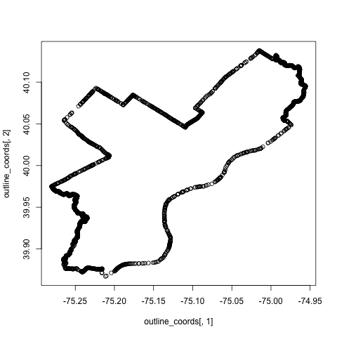
Now, we're ready to make the Voronoi polygons. So we'll load up the CSV containing the (lat, long) homicide locations and iterate a couple of times to regularize our polygons:
point_file <- read.csv("data/phl_homicide.csv")
voronoi <- deldir(point_file$POINT_X, point_file$POINT_Y)
vtiles <- tile.list(voronoi)

for (i in 1:2) {
    voronoi <- deldir(tile.centroids(vtiles))
    vtiles <- tile.list(voronoi)
}
Then we'll unpack each Voronoi tile and clip to the intersection of the city outline and the voronoi polygons using the polyclip function from the polyclip package:
vtiles <- tile.list(voronoi)

out_id <- c()
out_x <- c()
out_y <- c()
for (i in 1:length(vtiles)) {
    print(i)
    vt <- vtiles[[i]]

    ##Make a list for clipping with polyclip
    vt_a <- list(list(x = vt$x, y = vt$y))
    clipped_vt <- polyclip(outline, vt_a,op=c("intersection"))

    ## This is important in case a polygon essentially
    ## gets clipped out of existence
    if (length(clipped_vt) > 0) {
        clipped_vt <- clipped_vt[[1]]
        for (j in 1:length(clipped_vt$x)) {
            out_x <-  append(out_x,clipped_vt$x[j])
            out_y <- append(out_y, clipped_vt$y[j])
            out_id <- append(out_id,i)
        }
    }

plot_df <- data.frame(x = out_x, y = out_y, id = out_id)
Finally, we just have to do the slightly annoying work of creating a spatialPointsDataFrame for our clipped polygons and writing it out to geojson to load up for plotting in d3:
## Convert to polygon objects using plyr
polygons <- dlply(plot_df, .(id), function(x) {
    Polygons(list(Polygon(cbind(c(x$x,x$x[1]),c(x$y,x$y[1])))), ID = x$id[1])
})

## Just to make sure we're getting the right IDs for all of the included
## polygons (a bit hacky)
ids <- c()
for (i in 1:length(polygons)) {
    ids <- append(ids, polygons[[i]]@ID)
}

## Make into spatial polygons
srl <- SpatialPolygons(polygons)

## Now make some data to bind to the output
## spatialpolygons dataframe we'll export to geojson
in_data <- data.frame(id = ids)

##Fix row names to match polygon names (important!)
row.names(in_data) <- ids

##Make a spatialPolygonsDataFrame with one polygon for each of our
##voronoi polygons
spdf <- SpatialPolygonsDataFrame(srl, data = in_data)

##Write out to geojson
writeOGR(spdf, "phl_voronoi.geojson", "phl_homicide", driver = "GeoJSON")And that's where we're going to wrap up Part 1!
In Part 2, we'll talk about getting the polygon data into d3 and filling in colors based on polygon intensity. We'll also cover how to overlay the Voronoi intensity map with a neighborhood grid and to use tooltips that show neighborhood names on mouseover.